Article Written By Lisa Staton, Senior Graphic Designer, CSG Direct
Color Models and Bleeds
As a GM or marketing director, you don’t need to know how to build an ad. However, in today’s digital world, whether we’re posting on our social media pages, asked to provide a headshot for a conference, or simply need to communicate better with our art department, sign company or agency, there’s some basic knowledge we all need to have.
Marketers, does this sound familiar? Your art department asks you for specs for the ad that’s supposed to be submitted tomorrow and using terms like trim and bleed and telling you that cute clip art you wanted is RGB and not high enough resolution?
In this two-part article we’re covering basic design terms that will help you manage your personal communicate better (and impress the heck out of your staff!). Make sure to read Part I “Understanding Design Terms for the Non-Designer: Resolution and Image Types” at BetRavingKnows.com.
CHEAT SHEET FOR DESIGN TERMS
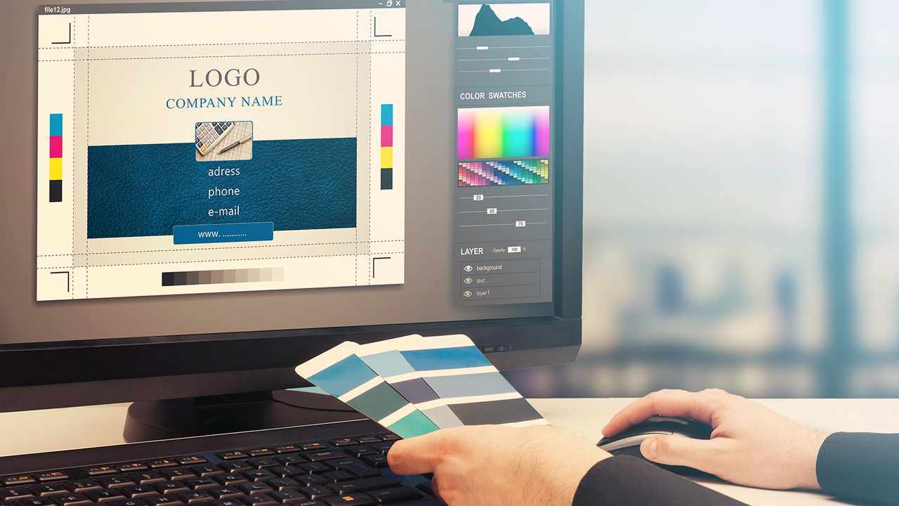
Color Models
When talking color, there are two main color models we will use. These are CMYK (print color) and RGB (screen color). If you are designing for anything that is intended to be printed, you design in CMYK. If you are designing for anything that is meant to be viewed on a screen, you design in RGB.
RGB stands for RED/GREEN/BLUE and it is an additive color model. Screens emit light as the colors red, green, and blue to make up all the colors you can see on a screen (the gamut). As you add more light in these three colors, your resulting colors will become lighter and lighter until you finally get white.
When working with websites and landing pages, you may also see HEXIDECIMAL colors. These will be six letters/numbers that start with #. This is a way of writing the RGB color for coding. Each pair represents R, G, and B, respectively.
CMYK stands for CYAN/MAGENTA/YELLOW/BLACK and it is a subtractive color model. Printers use toners/inks in these four colors in different combinations to build up all of the colors you see in print. Paper absorbs light, so when ink/toner is placed on it, you will see colors become darker and darker until you finally get black. Since the colors you see in CMYK printing are composed of ink/toner and not light, the colors will tend to not be as bright as those you see on a screen.
Your designer can usually convert RGB images to CMYK for print (and vice versa), but this can cause the bright colors you see on your monitor to look faded, dull, or inaccurate in the final printing. Make sure anything you want printed is in CMYK color to have better control over the final print colors.
You may also come across what we call spot colors or PMS (Pantone Matching System) color. This is a specific ink made by the Pantone Corporation that is just one color formulation and not created with a combination of different colors. You will usually use spot colors when you have a specific branding color that must be adhered to. Use of spot colors requires traditional offset printing, but most modern digital presses are able to simulate some spot colors.
If you have to simulate spot colors in a piece that is to be digitally printed, ask your designer to show you the spot color approximation in their Pantone swatch book or have a press proof made.
Bleeds
When a printed piece has color/art that extends all the way to the edge of the piece, we say that it is a full bleed piece.
Because cutting is not always perfectly precise, the art in the file must extend past the CUT line (the finished size) of the piece to ensure there is not a sliver of white paper showing around the edges when the piece is cut.
This is called a BLEED. You will usually find that most print providers will ask you to put 1/8 to 1/4 inch bleeds on the art provided. That means that each side has an additional 1/8 to 1/4 inch of artwork/color that extends past the cut line and will actually be cut off in the finished piece. It is important that all text/design is kept away from the cut line (inside the LIVE area) to avoid getting cut off when the piece is trimmed to its final size.
When you get ad specs that you pass on to your designer, you will see the terms BLEED, CUT, LIVE – followed by measurements. You can now be confident you know what that means!
Now you hopefully have a good understanding of some basic design terms that will help you communicate better with your art department. Please be kind to your designers. Bring them coffee.
Want more? Ready to impress your staff with your grasp of design terms? Read “Understanding Design Terms for the Non-Designer – Part I: Resolution and Image Types” on BetRavingKnows.com.